WanderUtah
Nov 2025
Mobile app concept for Utah's five national parks — trip planning that actually makes you want to go.
Overview

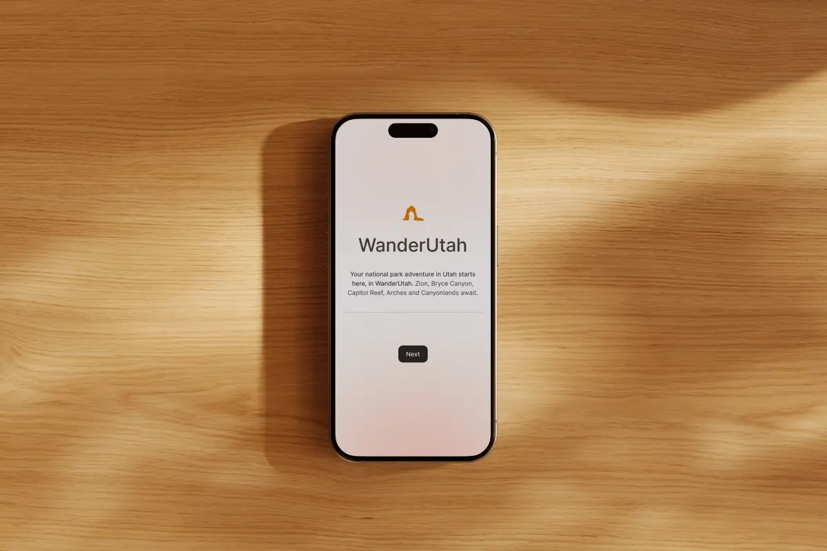
WanderUtah is a mobile app concept for exploring and planning trips to Utah's five national parks: Arches, Bryce Canyon, Canyonlands, Capitol Reef, and Zion. The project ran from early sketches through high-fidelity Figma prototypes, and the goal was to design something that feels as good as the landscape it represents.
The Problem
Most national park apps and websites are utility-first — they get you permits and directions, but they don't inspire. I wanted to design something that bridges the gap between trip planning and the feeling of actually being out there. The challenge was building that emotional quality into a functional, navigable app.
Research & Direction
I started with mood boards to define the visual language — what does "Utah" look like digitally? Not the tourist-brochure version, but the actual feeling of being there. I pulled landscape photography from each park and sampled directly from the rock faces, sky gradients, and vegetation. Arches gave me warm sandstone. Canyonlands was sage and dust. Zion skewed deeper — canyon shadow reds and cottonwood greens.
The early sketches were messy. I tried a tab-based layout first — one tab per park — but it felt like flipping between five separate apps. A map-based home screen tested better conceptually but added a tap before you could do anything useful. I ended up with a scrollable park selector that gives each park a hero moment while keeping the others visible, so you're always aware of the full collection.
The key tension throughout: five parks with genuinely different characters needed to feel like one cohesive product, not a sampler pack.
Design Decisions
How should color work across five distinct parks?
Chosen direction
How deep should the information architecture go?
Chosen direction
What feature gives users a reason to return?
Chosen direction
Retrospective
The prototype handles the discovery side well but drops off at planning — there's no way to save parks, build an itinerary, or share a trip with someone else. That's the obvious next feature set, and it's also where the hardest design problems live: how do you plan a multi-park road trip without the app becoming a logistics tool?
If I were continuing this, I'd also want to test with actual trip planners — not just people browsing parks, but someone actively booking a trip to Utah. The navigation structure works for exploration, but I haven't validated whether it holds up under real planning pressure where someone needs specific info fast.
The biggest thing I'd change: I spent too long on visual polish before locking down the information architecture. The three-level hierarchy works, but I arrived at it late, which meant reworking screens I'd already designed at high fidelity. Wireframes first, every time.
Outcome
WanderUtah taught me that constraints are a forcing function. Five parks that each needed their own identity — within one cohesive system — pushed me toward a theming approach I wouldn't have considered otherwise. The limitation was the design.
It also showed me the gap between an app that inspires and one that actually helps you do something. Inspiration is the easier problem. The harder, more interesting one is building utility that doesn't kill the emotion — and that's where I'd take this next.
Work together
Interested in this kind of work?
View my resume or send a quick note about a similar project.