Porsche Boutique
Nov 2025
A mobile app concept designed and coded to simplify browsing Porsche vehicles.
Overview
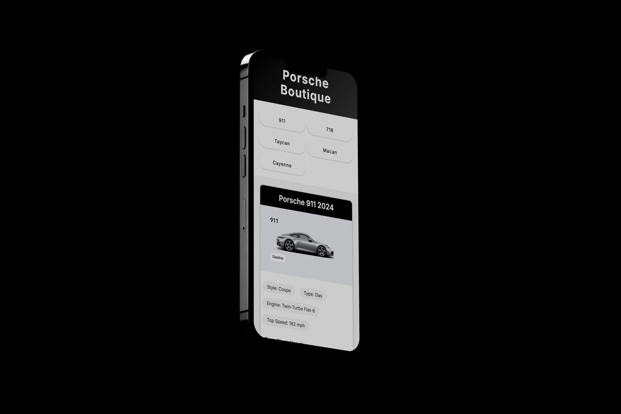
A self-initiated mobile app concept designed and built in HTML/CSS, inspired by the information density of the official Porsche website. I set out to create a simpler, cleaner interface for browsing the vehicle lineup — stripping the experience back to what someone actually needs: model names, specs, and visuals.
Design Direction
How much information does a browser need?
Chosen direction
Visual Language
The aesthetic had to match the brand without mimicking it. Porsche lives in dark, high-contrast territory — matte blacks, polished silvers, and tight typography. I worked within those cues while keeping the layout clearly a design exercise, not a brand asset.
What visual tone fits the subject matter?
Chosen direction
Layout Decisions
Each model card became its own design problem. I needed to surface enough to be useful — model name, body style, top speed, engine — without turning a browse screen into a spec sheet. The constraint forced a clear hierarchy: image first, identity second, numbers third.
How should model cards be organized?
Chosen direction
Reflection
Building in HTML and CSS without a design tool forced every decision to be a code decision. There was no Figma prototype to hide behind — if the spacing felt off, I fixed it directly. That constraint made the iteration faster and the final result more considered.
The main thing I would revisit is interactivity. The current build is a static browse experience. Adding transitions between the card list and a model detail page — and animating the spec numbers in on scroll — would make it feel like a real product rather than a styled component. That is the obvious next step.
The other thing the project exposed: automotive UI is almost entirely about photography. The design decisions I made were mostly about getting out of the way. If the images are good, the interface almost designs itself.
Work together
Interested in this kind of work?
View my resume or send a quick note about a similar project.