AOL
Nov 2025
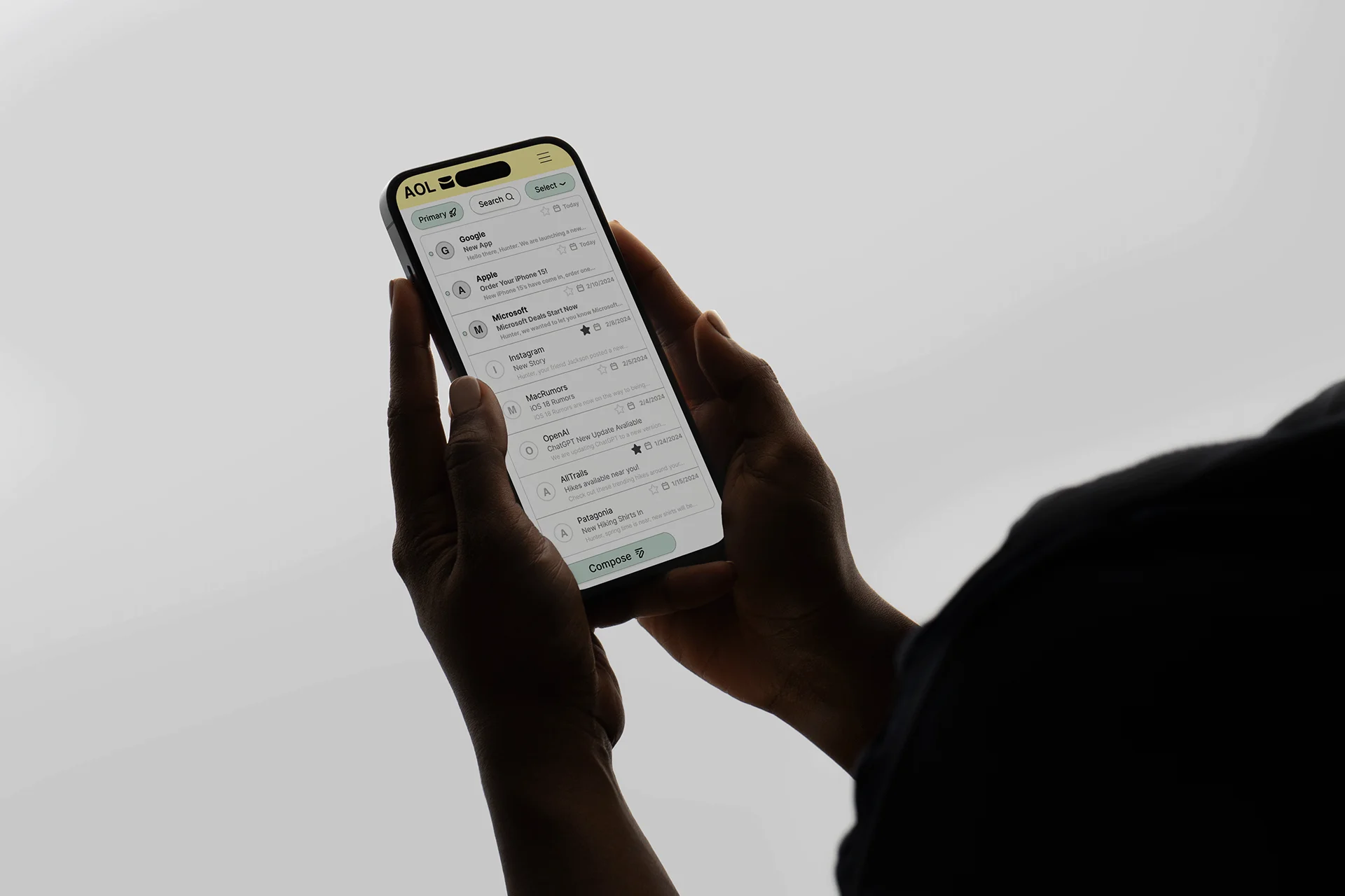
Mobile and desktop email app redesign — modernizing AOL's interface while keeping it familiar for the existing user base.
Category:Mobile Design
01
Overview
A class project to modernize AOL's email app for both mobile and desktop. I moved through mood boards, sketches, wireframes, and surface comps to arrive at a clean, simplified interface using soft mint and lemon tones — making the app more intuitive for AOL's core user base without losing the brand's identity.
platforms designed
design phases
02
Design Direction
What color direction suits AOL's audience?
Chosen direction
Work together
Interested in this kind of work?
View my resume or send a quick note about a similar project.